


THE NIAGARA PARKS COMMISSION
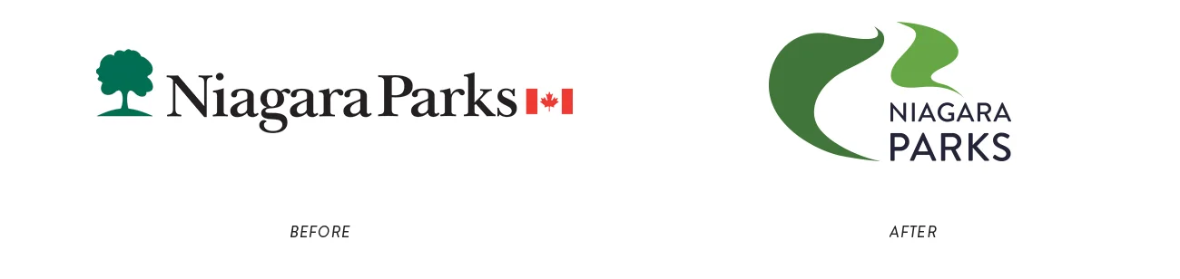
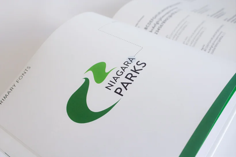
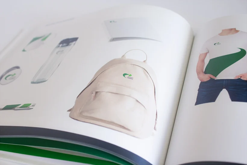
I decided to redesign the logo for The Niagara Parks Commission in order to make it more reflective of the organization and its values. The NPC takes great pride in preserving and enhancing the natural beauty of the Niagara River corridor and its Canadian shoreline. The logo is two leaves representing the green space surrounding the Niagara River and the River is the negative space created by the leaves. The two shades of green are incorporated into the logo to add a deeper feeling of nature. The “Niagara Parks” is a dark shade of blue to represent the river. I chose this coloUr system to further tie the nature element to the logo and brand.


©2026 REBECCA MCINTOSH